The Lot Radio: NYC Radio Station Rebrand
Role:
Strategy, Art Direction, Visual Design,
UI UX Design, Motion Design.
Why Rebrand?
The Lot Radio had already established itself as a beloved independent station, but its visual identity didn’t fully reflect its dynamic role as a creative hub—not just a streaming platform. The brand needed to evolve to emphasize its community-driven ethos, artist collaborations, and underground roots while maintaining its raw, New York energy.
The Lot Radio had already established itself as a beloved independent station, but its visual identity didn’t fully reflect its dynamic role as a creative hub—not just a streaming platform. The brand needed to evolve to emphasize its community-driven ethos, artist collaborations, and underground roots while maintaining its raw, New York energy.

Core Concept
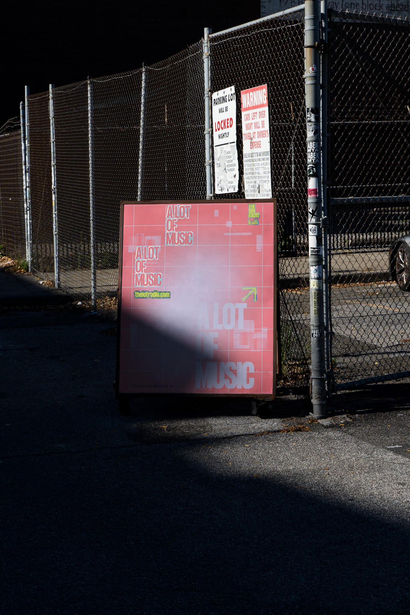
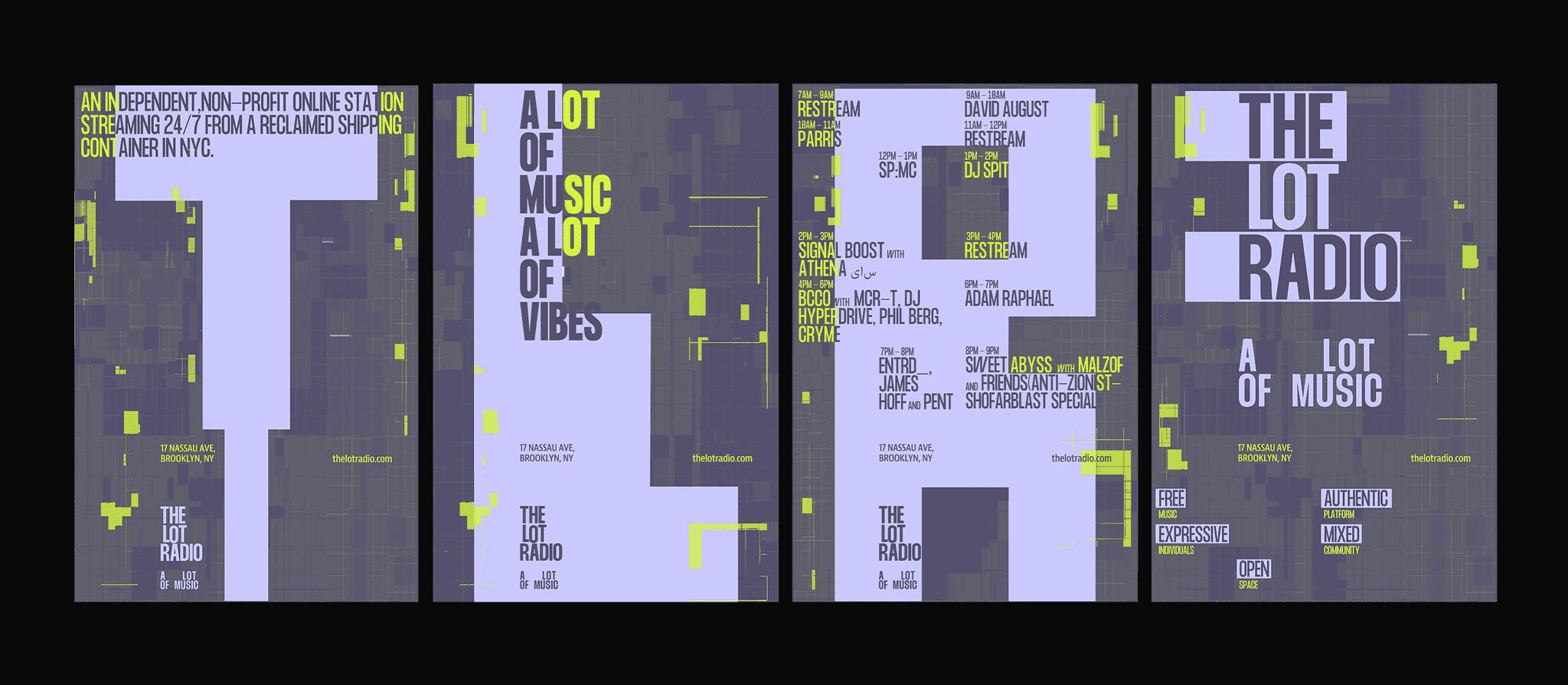
At its core, the system captures the intersection of electronic sound and underground culture, distilling the station’s kinetic energy and authentic environment into a cohesive visual language. It draws inspiration from the raw textures and vibrant expressions found throughout the space, channeling them into an atmosphere that’s as dynamic and open as the music itself.
At its core, the system captures the intersection of electronic sound and underground culture, distilling the station’s kinetic energy and authentic environment into a cohesive visual language. It draws inspiration from the raw textures and vibrant expressions found throughout the space, channeling them into an atmosphere that’s as dynamic and open as the music itself.
Execution
The overall system features elongated shapes that interact with both electronic sounds and the blocky visualizations characteristic of the station's environment. Secondary elements like spray paint and stickers enhance the authenticity of the underground music scene, drawing additional inspiration from the station's decorations. Vibrant colors unify all these components, creating an expressive and dynamic atmosphere that feels both open and cohesive.
The overall system features elongated shapes that interact with both electronic sounds and the blocky visualizations characteristic of the station's environment. Secondary elements like spray paint and stickers enhance the authenticity of the underground music scene, drawing additional inspiration from the station's decorations. Vibrant colors unify all these components, creating an expressive and dynamic atmosphere that feels both open and cohesive.

Strategy
To further the brand impression in immersive storytelling, I developed a content strategy that transforms the streaming radio station into a living archive of NYC’s underground. Highlighting artist takeovers (DJ booth confessionals, track breakdowns), kinetic live session edits that mirror the station’s DIY energy, and crowd-sourced visuals that turn listeners into collaborators.
To further the brand impression in immersive storytelling, I developed a content strategy that transforms the streaming radio station into a living archive of NYC’s underground. Highlighting artist takeovers (DJ booth confessionals, track breakdowns), kinetic live session edits that mirror the station’s DIY energy, and crowd-sourced visuals that turn listeners into collaborators.
UI UX Design
Supporting this strategy, the conference is set within two custom-designed domes that immerse attendees in the spirit of exploration. The design elements adapted brand colors, cohesive visual language, large-scale photography, blueprint-inspired graphics, and interactive installations. These are curated to tell the story of space travel in an engaging, accessible way.
Supporting this strategy, the conference is set within two custom-designed domes that immerse attendees in the spirit of exploration. The design elements adapted brand colors, cohesive visual language, large-scale photography, blueprint-inspired graphics, and interactive installations. These are curated to tell the story of space travel in an engaging, accessible way.


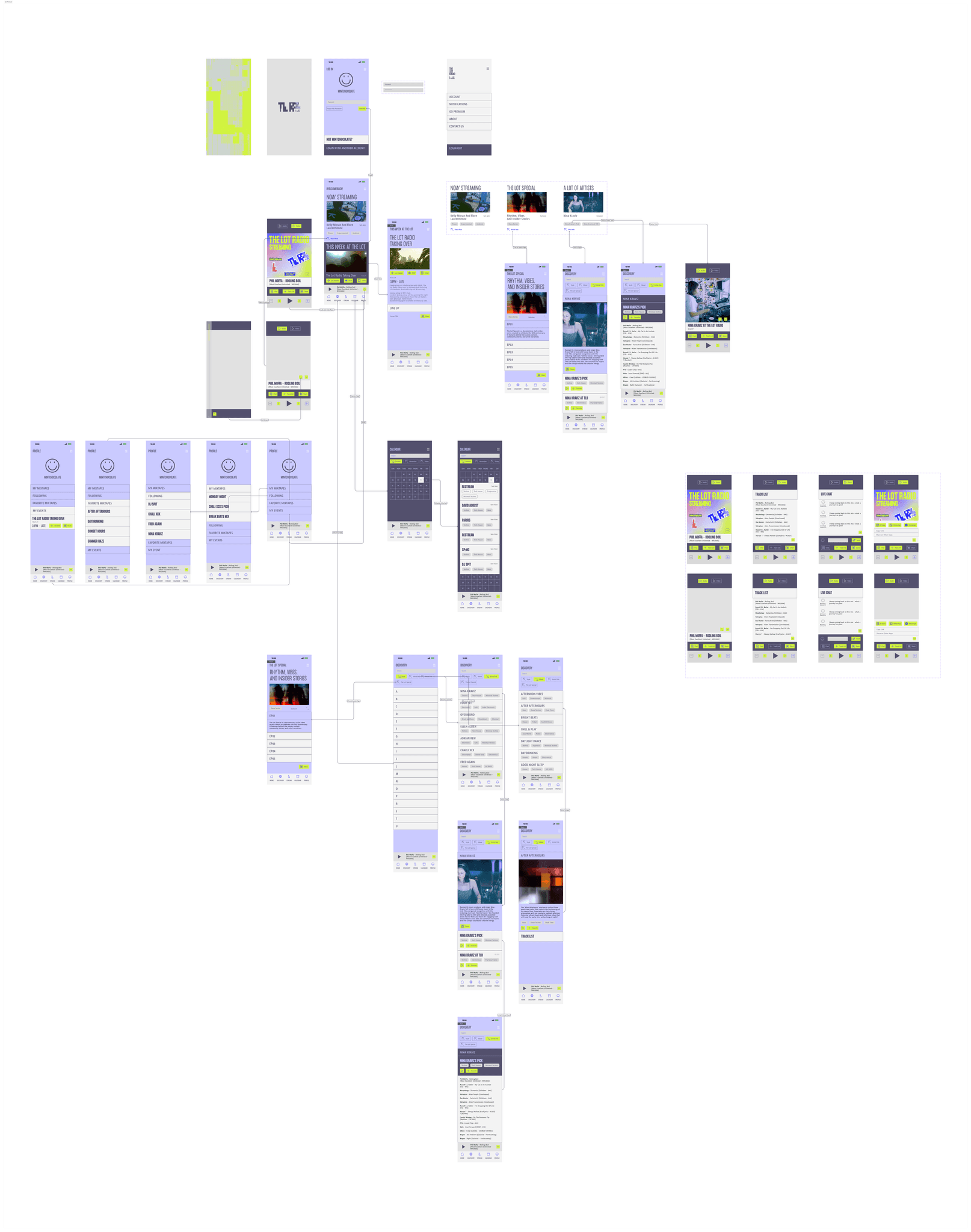
UX Flow
MORE PROJECTS
Identity Design, Strategy, Art Direction, Exhibit Design, Motion Design
MFA Project
2023
