The Darkroom: A Legacy Film Lab Rebrand
Role:
Strategy, Art Direction,
Visual Design, Motion Design.
Why Rebrand?
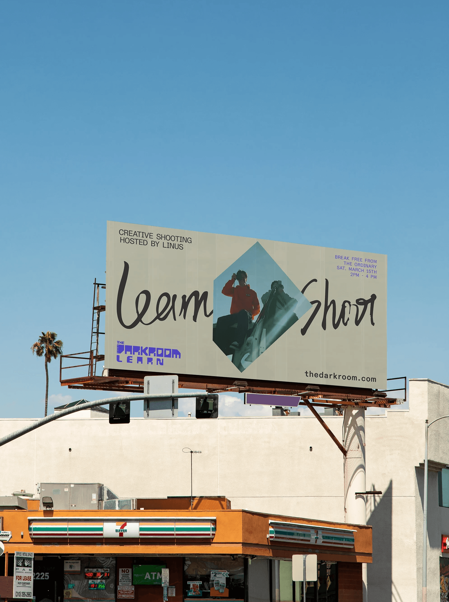
The darkroom is a film development lab located in San Clemente, California, offering mail-in film development service utilizing the traditional dip-and-dunk process. To build trust for new customers as a mail-in service and to support the growth of the film photography community. With nearly 50 years of industry experience, they have become the industry leader. In this project, I saw the opportunity for them to grow the service as an analog advocacy, educational, and a sense of community altogether.
The darkroom is a film development lab located in San Clemente, California, offering mail-in film development service utilizing the traditional dip-and-dunk process. To build trust for new customers as a mail-in service and to support the growth of the film photography community. With nearly 50 years of industry experience, they have become the industry leader. In this project, I saw the opportunity for them to grow the service as an analog advocacy, educational, and a sense of community altogether.


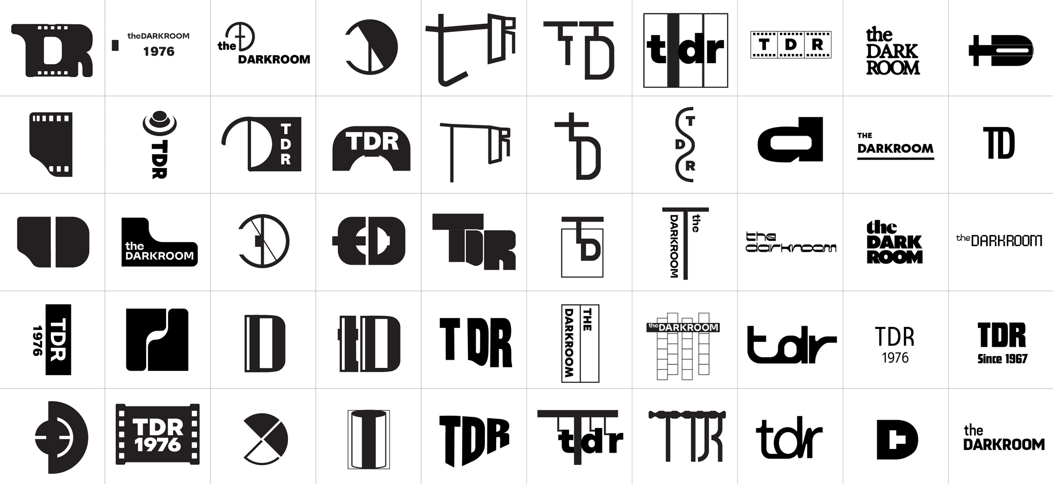
Core Concept
Inspired by The Darkroom’s traditional dip-and-dunk film development, the design system emphasizes its unique heritage while incorporating modern elements to scale across various applications.
Inspired by The Darkroom’s traditional dip-and-dunk film development, the design system emphasizes its unique heritage while incorporating modern elements to scale across various applications.
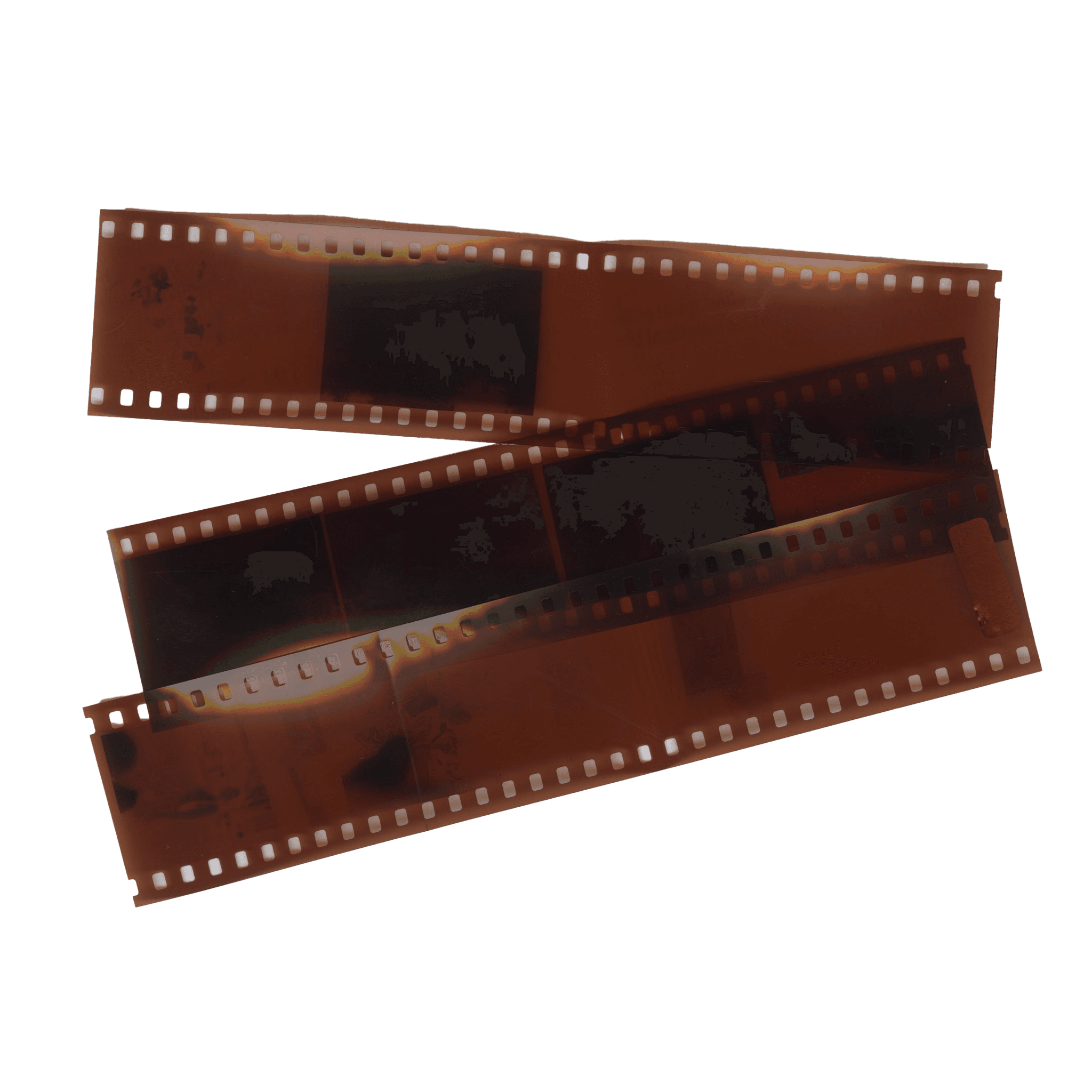
Shapes
The idea of “shapes within a shape” draws from the recognizable form of film negatives, integrating the gesture of hanging film to create a cohesive and scalable design system.
The idea of “shapes within a shape” draws from the recognizable form of film negatives, integrating the gesture of hanging film to create a cohesive and scalable design system.


Process


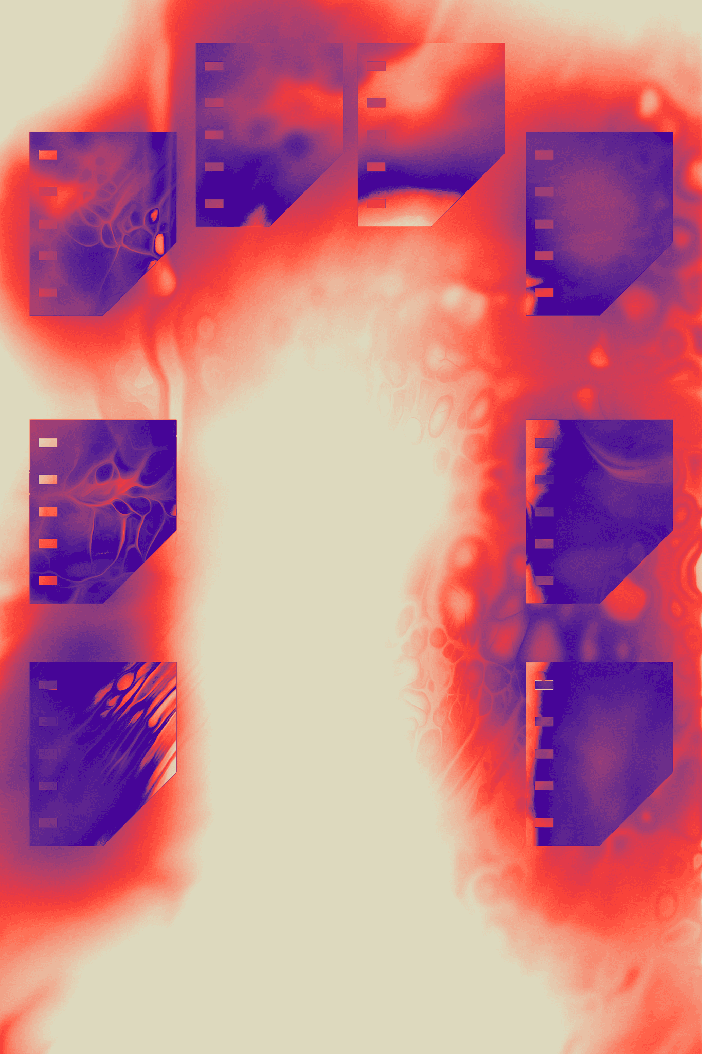
Sketches


MORE PROJECTS
Identity Design, Strategy, Art Direction, Exhibit Design, Motion Design
MFA Project
2023
